This photo shoot I wanted to be simple and just go with my first idea, of person view of society - a tea party/ elevensies. I wanted to use proper china, to make it look upper class and had put in though. I want to try and recreate some of Marin Parrs work, because he keeps it plain and just photographs what he sees.
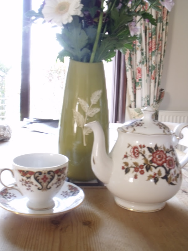
This was one of the first images I took and it isnt brilliant! To improve I could have used a blurred depth of field. I don't like the surroundings, and where the props are placed. Being inside doesn't make sense and doesn't show it to be a tea party. This image is also too tightly cropped. I have (by accident) cut off the handle of the cup, tea pot and cut the flowers on in the vase. The curtains do compliment the flowers and the flowers on the tea pot however they look out of place. There isn't any texture in this image, the flowers look very flat.

This image isn't as bad as the image above. The aspect which doesn't work is the wood effect on the table. As well in the top right hand corner you can see the spout of the tea pot, if this wasn't there then you could see a flower on the vase and it would work really well. The background works, by having the arch working as leading lines, because you can't see the end, it finishes on the corner of the cup. The lighting is very simple and plain and the cropping is too close, I have cut out the side of the plate. This would be improved if there was a blurred depth of field. I should have cleared the table before taking the photos you can see tinfoil and a piece of paper in the background. The vase gives the image height and texture from the leaves which are pattern on.


This is two images of the same picture, however I have changed the lighting. Both images don't work and are awful! The table is a mess and detracts from the main focus, there is too much background, the flowers should be in the picture, not just the vase. The background looks better in the second image (>) because it isn't so clear however it would look a lot better if there was a blurred depth of field. All together both of these photos don't work, and I won't be using this idea for my final piece.

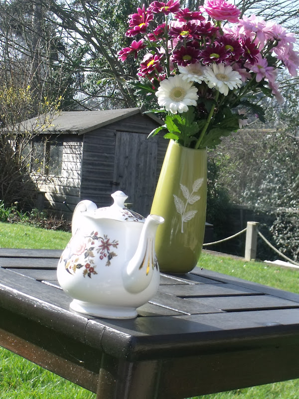
Here I have moved the photo shoot outside into the garden. This image would work so much better if I had used a blurred depth of field, and the shed was out of focus with the grass but you just had the colours and the outlines.
This image looks better than the ones before because I have included the flowers on the top of the vase. They add colour to the image and make it brighter. To improve this image the tea pot should be further back on the table and the vase should be at the end of the spout, so it works as a leading line. The flowers and trees add texture to the image and the flowers add height to the image, however the perspective is wrong and the flowers are bigger than the shed.

Here I have used height to my advantage (putting the props in height order. However there is a shadow on the table which detracts away the focus from the props. I have shown that it is tea in the cup by having the tea bag at the top of the cup however once again this image would be improved with a blurred depth of field, so it was out of focus and not so clear. I have tried to use the rule of thirds however it hasn't done anything to this image.

This image has a slight blurred depth of field, however not enough. The handle of the tea pot really detracts the focus from the cup, however the cup should be turned around so you can see its handle. I like how the liquid in the cup has a shimmer on it, and how you can see the tea bag sticking out. I have taken Marin Parr's inspiration by having it a plain image with the cup in the middle of the image (not using rule of thirds) and I think its too plain. The soft lighting in places makes the image bright and the harsh lighting in the background makes the colours stand out. Personally I feel this photo is too plain and simple - there isn't a lot going on.

The lighting in the image is too harsh. The foreground (the cup) is out of focus and blurred, making the colours not be so bright, however the background is in focus and sharp, it should be the other way around. I don't like the vase being in the background and I don't like how close up the camera is to the main focus. The shimmer on the liquid works well . The view of the table doesn't look good, so if I was to redo this I would move it onto the grass so the background wouldn't be so distracting.

This image is too dark however I like the positioning of it. The handles line up and the china matches. I have tries to use the rule of thirds. This image has texture by the grass. The bubbles in the cup are a very subtle element however works really well because they add a shine to it. The lighting is very directional and reflects off the tea pot. When I come to edit this I would photo shop in some lighting and lighting effects to improve it. A positive about the image being dark is the white of the china stands out.
When I come to add on the lighting effect I would make it be across the china to make that stand out more and keep the grass and background dark.

I have captured this from a high angle, to capture the bubbles and the shine on them. This is exactly what has happened. I don't like the positioning and the angle and I don't like how you can see the tea pot in the top right hand corner, however the bubbles have worked well.
The bubbles were done by having tea in the cup already, so it had the dark colours and then adding in washing up liquid, and using a straw to get as many bubbles as needed.


These two images have different lighting however I prefer the darker one because in the lightest one (>) you can see the shadows which makes it look non-professional.

The tight cropping on this image works really well because the main focus is on the bubble in the cup. I don't like how there is some (a little bit) of spilt tea on the bottom of the courser. Where it is put white, the orange colour stands out.
The positioning of the props works well however I don't like how you can see the legs of the table in the background. This would look better if there was a blurred depth of field. Also if I was to edit this I would up the contrast and brightness to make the colours stand out more and look brighter. I would also sharpen it to make the whole image look sharper.
The spoon works as a leading line however it draws your eye out the image. The bubbles look really good because there are the correct amount, it covers the top layer however you still get the colour of the tea coming though. The aspect of this image which I don't like is how there is spilt tea on the plate and how much it stands out because of the colour of it (orange) against pure white.
I have composed this image with having the tea pot in the background, however it would look a lot better with a blurred depth of field and if there wasn't a table leg and an airier in the background. The rope running along the background works as a leading line drawing your eye towards the tea pot. The green of the grass stands out and looks more vivid against the white of the tea cup. Also it clashes with red on the cups.

This image would look a lot better if there was a blurred depth of field because at the moment everything is in perfect focus. There are too many bubble on top of the tea cup, which means you don't get the colour of the tea through and it doesn't work correct because the bubbles take away the main focus which is the idea of the tea set.

The light leaks in this image take over and make it look too light. The background doesn't work however I like how you have the clump of grass in front of the cup giving it proportion.

 This is the first image of the bunting. It was a D.I.Y. one so I am going to take you through the stages of how I made it. This is the first image. It came with the triangles already cut up and some string so all you had to do was assemble it. This was easier said than done!


 This is all the props together. They are all the same colours to relate back to my themes and they relate back to the idea of a kids party because they remind me of my childhood.


.jpg)
.jpg)
.jpg)
.jpg)
.jpg)
.jpg)