Tuesday 1 May 2012

Conclusion and evaluation.

Exam question:
Robert Frank, Martin Parr and Will Klein have recorded aspects of their society in different ways.
They have present collections of images that express a personal view.
Refer to appropriate examples and create your own work which expresses a personal view of society.

How I have answered it:
My themes link back to this idea because the use of the British flag - the Union Jack, and how I represented it with the colours in my images, mainly with the use of props. My main theme is teenagers rebelling and this is represented through the poses of the model, and the heels. My third theme was a kid's tea party, This is also represented through the use of props, such as bunting, paper chains, and balloons. Also to help this idea where all the images were taken was in a party room, which makes it look fun.
I have displayed them in a row with the black and white smashed window one in the middle. This is because it is such a massive impact and so bold against the other two images it stands out.

How I displayed my final piece...

I displayed my final piece in gold frames. They are all the same style, to try and make it look more like a sequence which has worked. The reason why I chose to display them in gold frames was to give them a vintage feel as I never edited any of my final pieces in sepia. I put them in the frames however they didn't look correct, something was missing. I had to choose between black or white frames to go inside the frame. I choose to do white as most of my images are quite dark and it would brighten them up. I created the frames and removed the inside bit to create the middle section. I then put my images back together in the frames and it had improved them so much and brightened them up.I am very proud of my final piece and the frames finish it off nicely. The reason why they look so good is because they give the pictures a professional feel and look.

Monday 30 April 2012

Final Images.


Why I Chose My Final Images

I have turned this image 90 degrees since I wrote about it last time. This was because my other two images are landscape and I needed to make them a series and make them work. This works better as landscape because it looks more effecting and it looks like the broken glass is sticking up. This doesn't have to be known it was a door it could be perceived as a windscreen. It is just a panel of glass which is being broken by the heel.
I choose this image because it symbolises my main themes, which is teenagers rebelling. This is what I think of when people ask me to say my view of society. The news represented teenagers as negative people always doing things wrong - 87 % of all news about teenagers is negative. So no wonder why this is my view when it comes to society today.  The way this represents teenagers rebelling is by the use of heels and the way that it is breaking through the glass and cracking it.
By editing it in black and white it makes the image look simple, however it gives the glass texture and the heel stand out and be the main focus.


This image I had some issues with when it came to printing. I wanted to print it on A4 however it was slightly to big so I had to crop the side with the bottles, to make the cigarette  (which is the main focus) be able to stay on the page and be whole. This didn't worry me as my main focus was to be on the cigarette and the bottle just wanted to be a notion instead of another aspect.
I chose this image because it strongly represents all three of my themes. Teenagers rebelling, a tea party and also Union Jack. The way it represents teenagers rebelling is; the tattoo on the models arm, the cigarette and the drink on the left side. Also to emphasise this, the pose the model is in, where she is laid on the floor 'passed out'. The way that it represents the Union Jack is by all the props I have used. The floor, and balloons are red. The balloons and walls are blue. The top of the cigarette is white. All of this is complimented by the use of all three colours in the bunting and paper chains. The way that the tea party is represented is by the balloons, because they always remind you of your childhood and the splodges on the wall. Also the use of paper chains remind me of my childhood.
The reason why these three themes are my personal view of society are because, like I said above for the teenagers they are portrayed in a negative light and nearly every day in the news for doing something discriminative. The reason why a tea party reminds me of our society is because, more when you were a child but you always used to have them with your teddies. As well Britain is knows for drinking tea and elevensies. This is a high representation of Britain. The reason why I chose to use the Union Jack is because it's the flag of Britain and not so well respected however I personally feel it should be because it is part of our identity, from living here. I haven't use the Union Jack flag in any of my images because I wanted it to be more subtle than that. This is the reason why I have only used the colours (Red white and blue.) I have also only used these colours for the props so they are subtle however still there.
I edited this image with a lighting effect so the main focus was on the cigarette and the models tattoo. This was so it relates back to my theme and my exam question of personal view of society.  I also increased the contrast between colours so the theme of the Union Jack could come through stronger.


This is my third and final image in this sequence. I wanted to print this one in A3 and place it at the top to be a bold statement. However I wanted all 3 images to be printed on glossy photo paper, so they could be as higher slandered as possible and look professional. In school we do not have a printer which could do this and print out in A3 and on photo paper, so it either had to be A3, normal paper or A4 glossy paper. I went for A4 so I could have the professional style and look to it. This wasn't to bad because it meant all of my images are the same size as one another.
Since I last wrote about this all I had to do was slightly crop the top section of this as you could see a little bit of the ceiling in the top left hand corner.
The way that this image represents my themes are the same as above. Teenagers rebelling by the pose of the model on the floor and the main focus - the heels. The way that the Union Jack is represented is by the colours of the paper chain, the floor, the walls, the splodges on the walls and the balloons. There isn't really anything that represents the kid's party apart from the benches.
I haven't edited this image apart from the slight bit of cropping, because I didn't need to as the blurred depth of field did all that I needed it to.

Photo shoot as a group - Phone edits

 This image is very pixelated, however it breaks up the colours. What I have done is increased the contrast which makes the colours stand out more and makes stand out more against the other colours. This image is slightly too dark however on the lightest aspect of this image there is shadows which stand out.
This image is very pixaleted which stands out even more where it is against black and white.  It is very dull even though I have increased the contrast. The aspect which does work is the three tone bunting, because even though it is meant to be red white and blue it still is the three colours and different shades. This is the same for the splodges.

Photo shoot as a group - Camera edits

Here I made a focus section to make the main focus be on the Union Jack. I need to redo this because the photo shopping on the plate is very poor and unprofessional. It stands out and really represents my theme of Britain.
As you can see here I have done the same thing with a different image. I made the bunting the colour focus so it would be the same colours as the plate however being in a different format. The colours aren't so bold as I would have hoped. I have copied and pasted the colours from the original but I would want to change them as the white is more of a cream colour and the blue is too dark. I want them to be as vibrant as the colours above.


Here I have tried this image in two way, black and white and in sepia (orange) I prefer it in sepia where it gives it the old look, because this makes it more of a tea party style.

Here I have changed this image to more of an orange sepia. I prefer the darker one because it makes the image look older, instead of just orange like this one does.

Photo shoot as a group - Phone originals

The composition of this image, I don't like because of  the ceiling however I can easily edit that out. The posing of the image looks natural and relaxed because neither model is looking at the camera. There are three tea cups and two models. Where both models are looking out of the image - as an on looker this draws your eyes out of the image as well. None of this image works together and no elements complement each other. It doesn't represent any of my themes to a great extent.
If I hadn't captured the bench in this image it would be a strong representation of my themes, however the bench takes the focus away from the models. This image needs cropping because you can see the neck chain for the camera in the bottom right hand corner. The reason why this image is a good representation of my themes are; you have the bunting and the plates on the wall, which symbolise the colours, then you have the tea party and kids part represented by the place, the splodge on the wall and the mugs, with bubbles. Then you have teenagers rebelling as what is in the cup is not tea as it is green and the poses of the models, make the look drunk - one with her eyes shut, one looking at her drink and the other just gazing into space. The poses work however the composition of this image doesn't.

All the poses in this image complement one another and the high angle out a different twist on it, highlighting the fact that there are bubbles on top of the mugs. If I was to redo this image, I would change the positioning of it, so that it wasn't a yellow splodge behind the models it was either a red, white or blue one. This is so it would emphasise all the colours which are going on in the image, making them bolder.

 Here I have tried a high angle for this image so you don't get the models face in it. Also by using this high angle, it means you can see that what is in the mug, isn't tea as it is green. This adds something unique to the image and adds a quirky twist. By not being able to see the models face mean the props become the main subject and focus in this image. I have sat her by a blue splodge to emphasis the colours. There is too much going on the floor, if I was to redo this image I would get rid of the second plate which is by the models foot. Even though it is hidden, it still takes away some of the focus from the model.
Once again the problem with this image is there is too much going on, on the floor - to many props being used. This doesn't help that there is one Union Jack plate stuck on the wall, detracting the focus away from the models face as it is the same height. The pose of the model is very natural and relaxed however I don't like how she is looking at the camera. Where this has been taken on an iphone 3gs, the image has come out very granular and pixalated. There is a mystery to this image and that is why is she sat the wrong side of the bunting. I tried to add a quirky and unique twist to the image but also it slightly represents that she could be drunk because it's not a normal thing to be doing. I can't decide whether this works or not.
This image is very pixalated! The pose of the model works and this is complimented by the angle the image is taken at. Once again by taking this image from a high angle, you can see into the cup and see that it isn't tea - it is green. This image would be a lot stronger if it wasn't so pixelated because it would be more in focus; more clear and able to see different things - such as the bubbles on top of the mug. All the colours complement each other however there is slightly too much going on. The plates aren't needed and would look just as effective if it was just a couple of balloons around the models, with the bunting. The bunting represents my theme of Britain because it is a very British thing to have and use in the case of a party.
This image is an action shot. The model sat in the corner is moving which had added a blurred effect, which added to the pixalated image makes it look very unprofessional and just an awful image. The bunting in this image looks really effective, because you get the repeat of the colour pattern, this strengthens the colours and makes your realise that all the props are that colour. The model in the foreground doesn't look like she is drinking as the cork is still in the bottle. I like the positioning of the models and how the picture is taken at a diagonal. This works as a leading line - to emphasise the bunting also works as a leading line, drawing your eye to the second model.
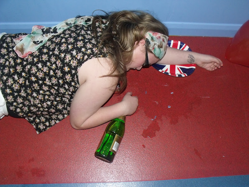
The posing of this image would look a lot better if the model was laid on the floor, however keeping the high angle. I tried to use the rule of thirds with the place of the champagne on the intersect however it is slightly to high up. All the balloons are in one section of the image and would look a lot better if they were dispersed throughout the gaps on the floor. The colours complement each other and there is still the red of the floor, blue of balloons and white on the models shorts. If I was to restyle this I would have her on the floor but also have her wrists twisted slightly more round, so you could get the full effect of the tattoo - to represent the teenagers rebelling.


This angle is completely wrong because you can see the ceiling of the building, however I can't crop it out because I would be cropping off the models head. Also you can see the underside of the tables which don't look effective and look so unprofessional. The model on the floor doesn't look past out because her hand is resting on a balloon, so it just looks as if she is laid on the floor. The lighting for this image is all wrong. It is too harsher light coming over the top of the wall, adding lens flare to the image. I have tried to use the rule of thirds however it hasn't added anything to this image. The bench works as a leading line, drawing you eye from the model in the foreground to the model sat up.
The lighting in this image is wrong because it has created shadows on the wall in the background. The pose of the models is natural and as if they are just having fun - no camera about. The bubbles aren't really captured in this image, however if I redid this image with a proper camera instead of my phone they would. The reason why I did take these with my phone is so I could edit them on the phone apps to create the vintage style.


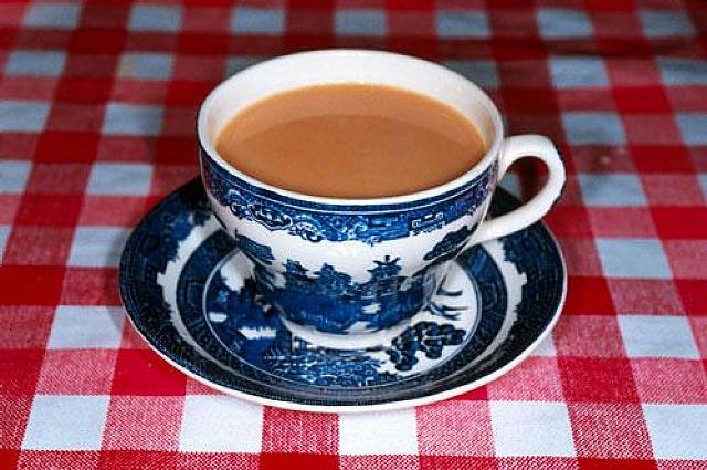
This is a very simple image with only two prominent colours used - the blue and white. There is too much space is the foreground however this image is too tightly cropped around the mug. The colour blue is complimented with the blue on the walls and the white of the mug is complimented with the white splodge on the wall. I have managed to capture the bubbles on top of the mug however if I was to reconstruct this image I would do it so there were slightly more bubbles on top. This image I took the idea from Martin Parr and his simple work of a mug and no background. It is simple but effective.

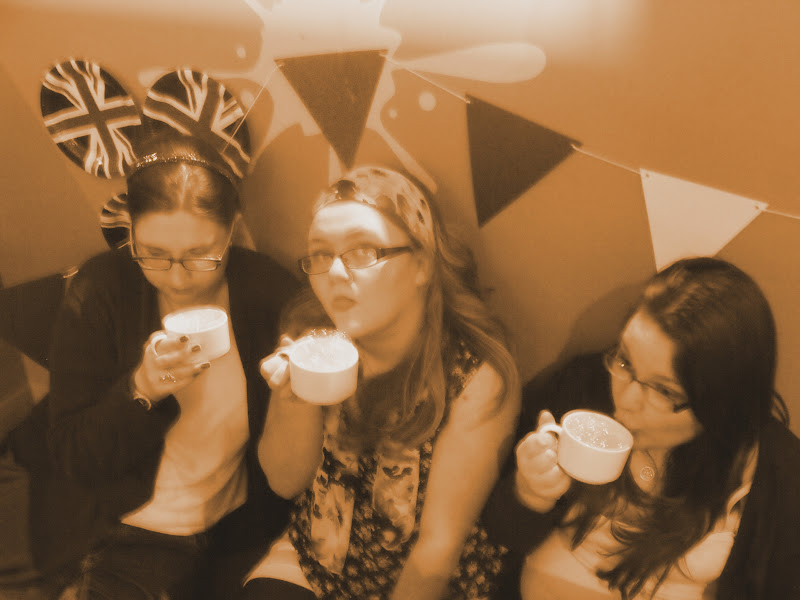
The table in this image works as a leading line drawing your eyes up to the models. This is emphasised by the bench which runs parallel to it. The poses of all three models looks relaxed and the way they are not looking at the camera shows they are not aware of it. The only aspect which I don't like about this image is the yellow splodge in the background. It would look more effective red, or if I had the props up against it - so the bunting and the paper chains, this would then draw in the other colours compliment them and fade out the brightness.
The image is very out of focus. The model to the right hand side must have been moving to create such a blur. There is harsh lighting coming from over the wall, creating shadows on the wall, which detracts focus from the models.

Friday 27 April 2012

Photo shoot as a group - Camera originals

I have incorporated the theme of the Union Jack into this image with the colours - red white blue. This is done via the use of the flags, balloons, plates, walls and floor. I have tried to include the theme of a tea party by using the tea cup, however I have used green liquid and put bubbles on top to make it quirky and different.  My third and final theme was teenagers drinking. This has been represented in this image by the model and the bottle of champagne by her foot. The pose of the model works well however the cup should be the other side of the bunting. It looks slightly too posed like this. Although it works where the models isn't looking at the camera. I haven't composed it using the rule of thirds however I don't feel it needs it, it works well the way it is.

This image follows my themes well, however the model in the middle is slightly to posed. I like how the other two models aren't looking at the camera, so it doesn't look posed. The look of the green drink in the cup nearest the camera gives the on-looker the impression that they don't no what it is in there. The colours of the bunting compliment with the colours on the paper plates, that to add a quirky twist to it, I have stuck them up on the wall - somewhere they shouldn't be.
This image looks so relaxed and casual. It is one of my favourite ones because it doesn't look posed. If I was to redo this I would have added more bubbles into the cups so that you could see them to add that difference to the image. The plates on the table compliment the paper chains behind the models and also relate back to my theme of Britain. The use of levels in this image is prominent but the different heights of the mugs and the different heights of the models.
This image is the same posing as the one above. It is very relaxed and non-posed. It works where none of the models are looking at the camera, and how the facial expressions look like they are concentrating on what the model is saying. The colours work well apart from the massive yellow splodge behind the third model. That stands out and is the main focus where it is so bright. This could be changed with editing on photo shop.

Here I have tried to sum up all of my themes in an image without the use of a model. I have got the champagne to symbolise the drinking. The tea cups with the bubbles to represent the tea party - however having green liquid in to make it quirky and unique. Also to tie in two of the themes the paper plates on the wall represent the kid's tea party and the representation of Britain and the Union Jack. This is also emphasised by the colours on the wall and the bunting hanging along. The bunting works as a leading line. If I was to edit this I would change the colour of the splodge on the wall from yellow to either red white or blue to tie in with my theme.


I have got rid of the paper plate from underneath the mugs and got rid of one of them. This was because I personally feel there was too much going on and if it was to be simpler it would be more of an impact to the audience. If I was to redo this image I would put it in the centre of the table and not on the corner because you can see it in the image. If I was to edit this image I would do the same as above and change the colours of the splodges on the walls, this is because at the moment they are the wrong colours and would be a lot more effective if they were red white or blue. I didn't compose it using the rule of thirds and I feel I should have tried it as there is too much background.
Here I tried to play around with the use of levels and heights within an image. This is shown through one model being on the floor one on a bench and the other on the table. It hasn't worked and I don't like the pose or composition of the image. There is too much going on, on the table and on the floor. The models poses aren't correct and it looks too posed. The models don't look comfortable and none of my themes come across in a strong matter in this image.
This image I have captured two of the models in one. It looks casual and relaxed as the models aren't looking at the camera however, neither model looks comfortable with what they are doing so it put an edge to the image. The colours work so well as the splodges are also red white and blue but this image needs slight cropping as the table is in the foreground.
Here I have used a higher angle to try and capture the green in the cup along with the bubbles. I haven't manages to capture the bubbles however the green as a twist to the image. This image needs some cropping done to it as you can see one of the models foot at the top of the image and to the right side you can see the table. The champagne bottle on the plate doesn't work however having the plate on the floor works because it ties in all the colours.
This image needs slight cropping done to it, and I don't like the shadows which are at the top of the image. If I was to edit this image I feel I would do it so there was two focus colours or focus sections. The first would be the plate and the Union Jack and the second would be the green in the cup. I feel that would give it a unique twist and be different but also stand out and catch people's eyes.
Here I have got all three models in one image together. It is really effective and looks so relaxed as if they are having fun. The colours of everything is the red white and blue and this is emphasised because there is so much. My only problem is there is too much going on within this image - too many props. The main element which I like and I would make sure stands out more in the editing process is the green from inside  the cups.  The bunting works as leading lines.

Here I have tried to use levels however in a different way. I have someone laid on the floor someone knelt and someone stood. This works well and draws your eyes downwards to the model on the floor. The bunting in the background gives it the theme of the Union Jack however I don't like the light leaks at the top of the image. This happened because there was harsh light coming from over the top of those two walls and coming straight to the camera. Adding a long exposure to this means this was the outcome.

The models legs work as a leading lien drawing your eyes into the image. The subtle use of levels is a lot more effective. I don't like how you can see the underside of the benches and the tables - it draws the attention away from the models.
This image needs a bit of cropping done to it, to get rid of the wonky blue line down the bottom. Also I would crop out the balloon in the top right hand corner. The pose, the champagne and the tattoo all link into my theme of rebellion and represent it nicely. All the colours are red white and blue to link into the theme of Britain and the Union Jack.
 

Wednesday 18 April 2012

Reconstruction of Marin Parr's work

Reconstruction of Marin Parr's work.

This is the image by Martin Parr, which I am wanting to recreate. I will put my own style on it and make it my own with subtle twists.


This is my own reconstruction. The original image is the first one. I have take Marin Parr's style by keeping it simple and plain, by having just a cup however I wanted to create mine unique so I out it outside on the grass and added a spoon and a tea bag. It works really well with the spoon however the teabag it too much and doesn't work.
The effect of putting washing up liquid in the cup and blowing through a straw to create bubbles works really well! It gives the picture a little twist.
I have tried to keep the same amount of background so that it doesn't take the attention away and also I have kept the cup in the centre of the image so it is the main focus. The spoon works as a leading line.


Marin Parr keeps his editing simple and doesn't do much so this is what I decided to do. 
I have done this editing by upping the contrast and saturation, to make the colours more vibrant and stand out more. Also by doing this it brings out the colours on the bubbles and make them stand out more as they are a major part of this image, and they are my own unique twist.
I prefer the teabag in this image because it is darker and so blends into the background and doesn't stand out as much, it is subtly there.