 I have incorporated the theme of the Union Jack into this image with the colours - red white blue. This is done via the use of the flags, balloons, plates, walls and floor. I have tried to include the theme of a tea party by using the tea cup, however I have used green liquid and put bubbles on top to make it quirky and different. My third and final theme was teenagers drinking. This has been represented in this image by the model and the bottle of champagne by her foot. The pose of the model works well however the cup should be the other side of the bunting. It looks slightly too posed like this. Although it works where the models isn't looking at the camera. I haven't composed it using the rule of thirds however I don't feel it needs it, it works well the way it is.

 This image is the same posing as the one above. It is very relaxed and non-posed. It works where none of the models are looking at the camera, and how the facial expressions look like they are concentrating on what the model is saying. The colours work well apart from the massive yellow splodge behind the third model. That stands out and is the main focus where it is so bright. This could be changed with editing on photo shop.

I have got rid of the paper plate from underneath the mugs and got rid of one of them. This was because I personally feel there was too much going on and if it was to be simpler it would be more of an impact to the audience. If I was to redo this image I would put it in the centre of the table and not on the corner because you can see it in the image. If I was to edit this image I would do the same as above and change the colours of the splodges on the walls, this is because at the moment they are the wrong colours and would be a lot more effective if they were red white or blue. I didn't compose it using the rule of thirds and I feel I should have tried it as there is too much background.
 Here I tried to play around with the use of levels and heights within an image. This is shown through one model being on the floor one on a bench and the other on the table. It hasn't worked and I don't like the pose or composition of the image. There is too much going on, on the table and on the floor. The models poses aren't correct and it looks too posed. The models don't look comfortable and none of my themes come across in a strong matter in this image.


 Here I have got all three models in one image together. It is really effective and looks so relaxed as if they are having fun. The colours of everything is the red white and blue and this is emphasised because there is so much. My only problem is there is too much going on within this image - too many props. The main element which I like and I would make sure stands out more in the editing process is the green from inside the cups. The bunting works as leading lines.
Here I have tried to use levels however in a different way. I have someone laid on the floor someone knelt and someone stood. This works well and draws your eyes downwards to the model on the floor. The bunting in the background gives it the theme of the Union Jack however I don't like the light leaks at the top of the image. This happened because there was harsh light coming from over the top of those two walls and coming straight to the camera. Adding a long exposure to this means this was the outcome.

The models legs work as a leading lien drawing your eyes into the image. The subtle use of levels is a lot more effective. I don't like how you can see the underside of the benches and the tables - it draws the attention away from the models.
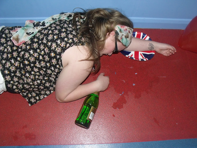 This image needs a bit of cropping done to it, to get rid of the wonky blue line down the bottom. Also I would crop out the balloon in the top right hand corner. The pose, the champagne and the tattoo all link into my theme of rebellion and represent it nicely. All the colours are red white and blue to link into the theme of Britain and the Union Jack.
No comments:
Post a Comment