
This image has used lines to draw the onlooker's eye into the image. By using both horizontal and vertical lines it sections to the picture up - and obviously he has used the rule of thirds, when using this many lines. The only things which personally I feel doesn't work are the peoples face - out of focus.

There is a repetition throughout all the Robert Franks pictures and that is that he uses lines to draw people attention. The lines used in this one are the horizontal ones of the bench. The two people look awkward as the way they are composed to be sitting looking away, and the white of her dress stands out against the black of his suit.

This image was a very bold statement back then, because the colour of the woman's skin and the colour of the baby skin - this shows how much society has changed and I could incorporate that into an image how nowadays its fine to be different coloured skin and be together.
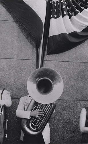
This image is quirky because the top of the instrument is where his head should be. This is about society because by the use of the flag at the top of the image. The aspect of this image I don't like is how you can see two arms in either side of the image. This draws attention from the main focus. The white of the jacket contrast the darkness of the image. There isn't really a range of tones used which is better. However you can see there is texture to the wall as it is all granular.
No comments:
Post a Comment